DULUX COLOUR OF THE YEAR 2024
“Like a whisper of reassurance in a moment of stress”
Dulux has announced its paint colour of the year for 2024 and it is…drum roll…Sweet Embrace.
I watched the unveiling live on Instagram and I have to say that I was pleasantly surprised. If you read my post regarding last year’s choice, Wild Wonder, you’ll know that I was less than enamoured but this time I think they’ve got it bang on. As a lover of quiet colour, I am delighted at the choice. My ‘Be The Love’ collection is awash with shades of neutral pink so I’m already ahead of the game and I’ve just realised that Sweet Embrace is very similar to my brand colour! I’m so on trend!
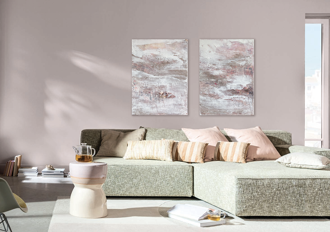
How good do my paintings, Philia and Philautia look against Sweet Embrace?!
The colour of the year is decided based upon predicted trends and the global mood of the moment and Sweet Embrace, a grown up shade of pale pink, represents a need for calm reassurance amidst uncertainty.
'It's the perfect modern neutral that you can use with confidence,” says Dulux’s Creative Director, Marianne Shillingford. “it has a visual softness that calms the senses and creates an atmosphere of serenity,” she adds.
Like Wild Wonder, Sweet Embrace is another metameric colour, meaning that it changes throughout the day depending on the light that befalls it. In the east light of morning it will appear cooler and crisper but in warm afternoon sun violet tones will be more prominent. Given that violet is the colour of intuition and the third eye chakra, and pink is the most compassionate of hues, I like to think that this delicate colour also recognises the Great Awakening that is sweeping the planet and a shift in attitudes to all things spiritual.
In these unsettled times we are increasingly searching for answers from a higher power and maybe Sweet Embrace can be the catalyst that not only paves the way for a more loving society but also connects us all on a soul level and lifts us collectively into the 5D.
Now wouldn’t that be nice?
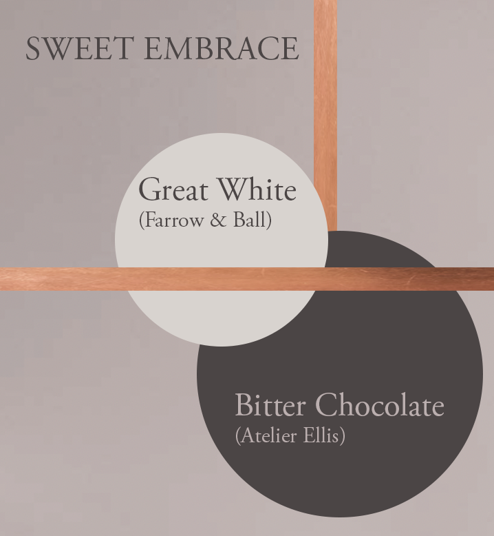
CHROMOTHERAPY TIP!
Dulux has created three different colour stories in which to use Sweet Embrace. My favourite is their Warm palette but I’d go a step further and pair it with even darker brown shades.
Rich velvety chocolate tones will help you to feel stable, secure and grounded, while copper or rose gold accents add sophisticated warmth. A highlight colour with pink or lilac undertones, such as Farrow & Ball’s Great White, will balance the scheme. When teamed with the kind, nurturing Sweet Embrace you can’t fail to feel comforted. It’ll be like getting a big, squishy Nanna-hug every time you enter the room!