COLOUR PSYCHOLOGY IN ART
There are now just under two weeks to go until the second annual Home Staging Association Forum and I’m delighted to have been asked to be a partner for the event. I will be showcasing my art service which provides affordable artwork for stagers, stylists and designers and was asked to provide something to put in the goodie bags that each guest will receive at the event.
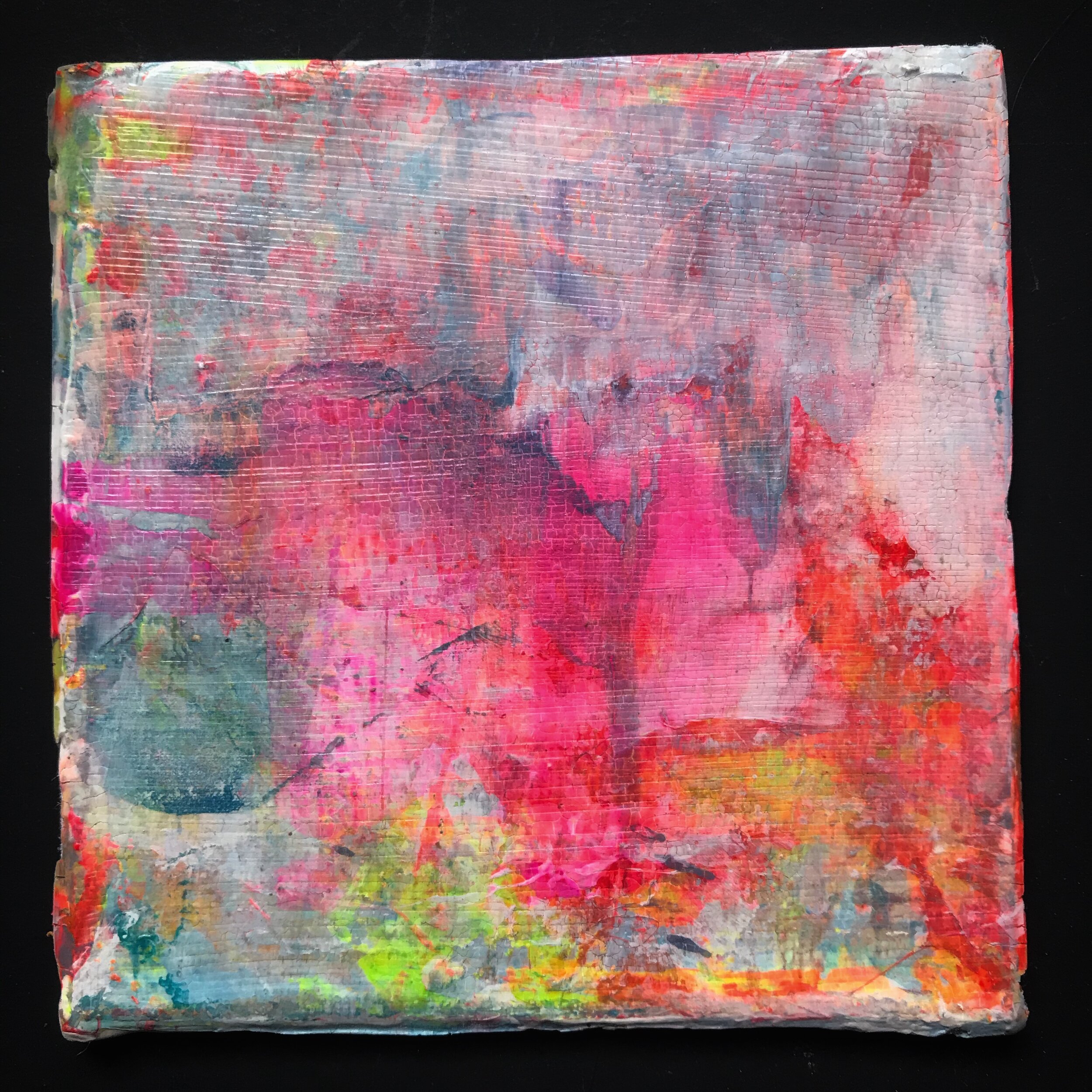
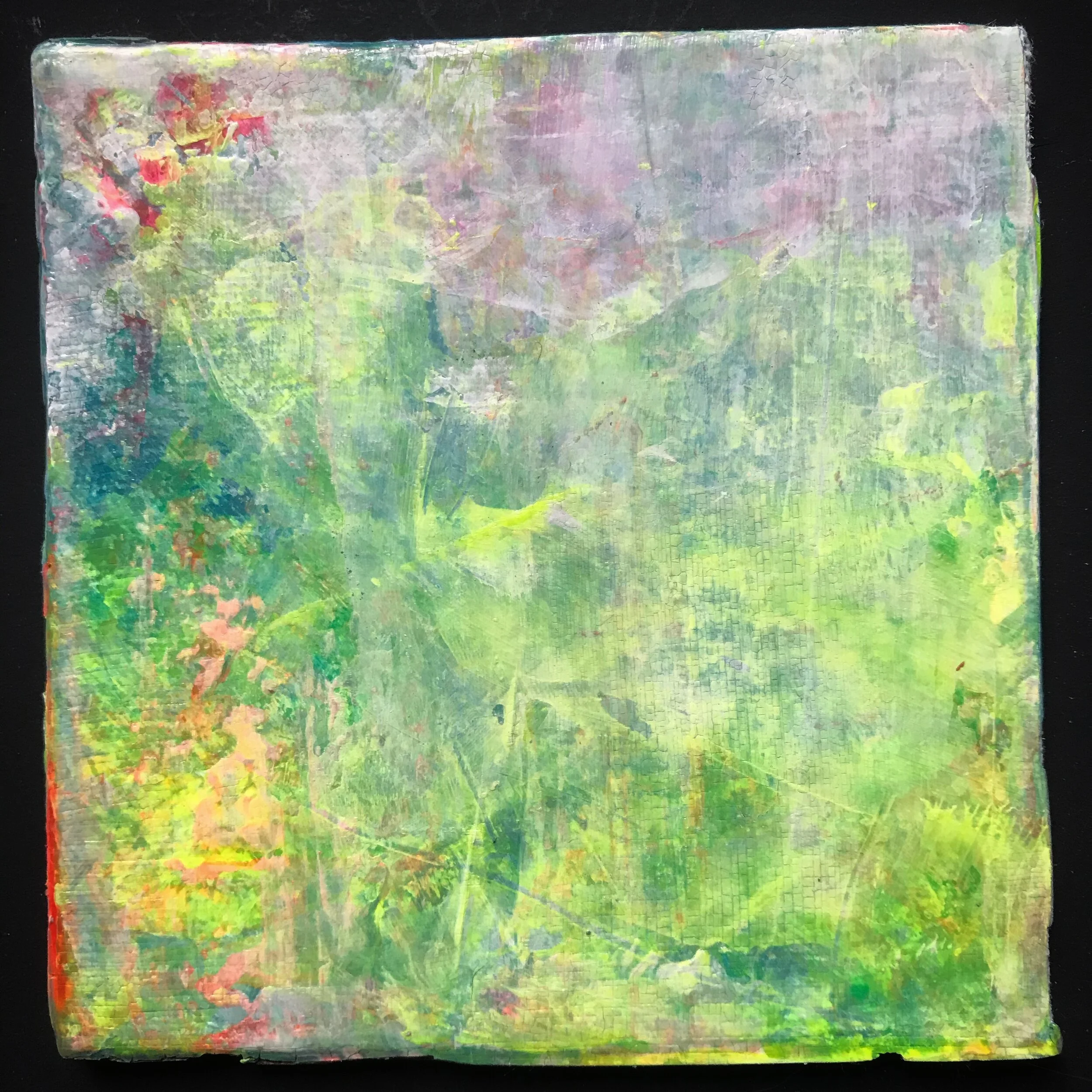
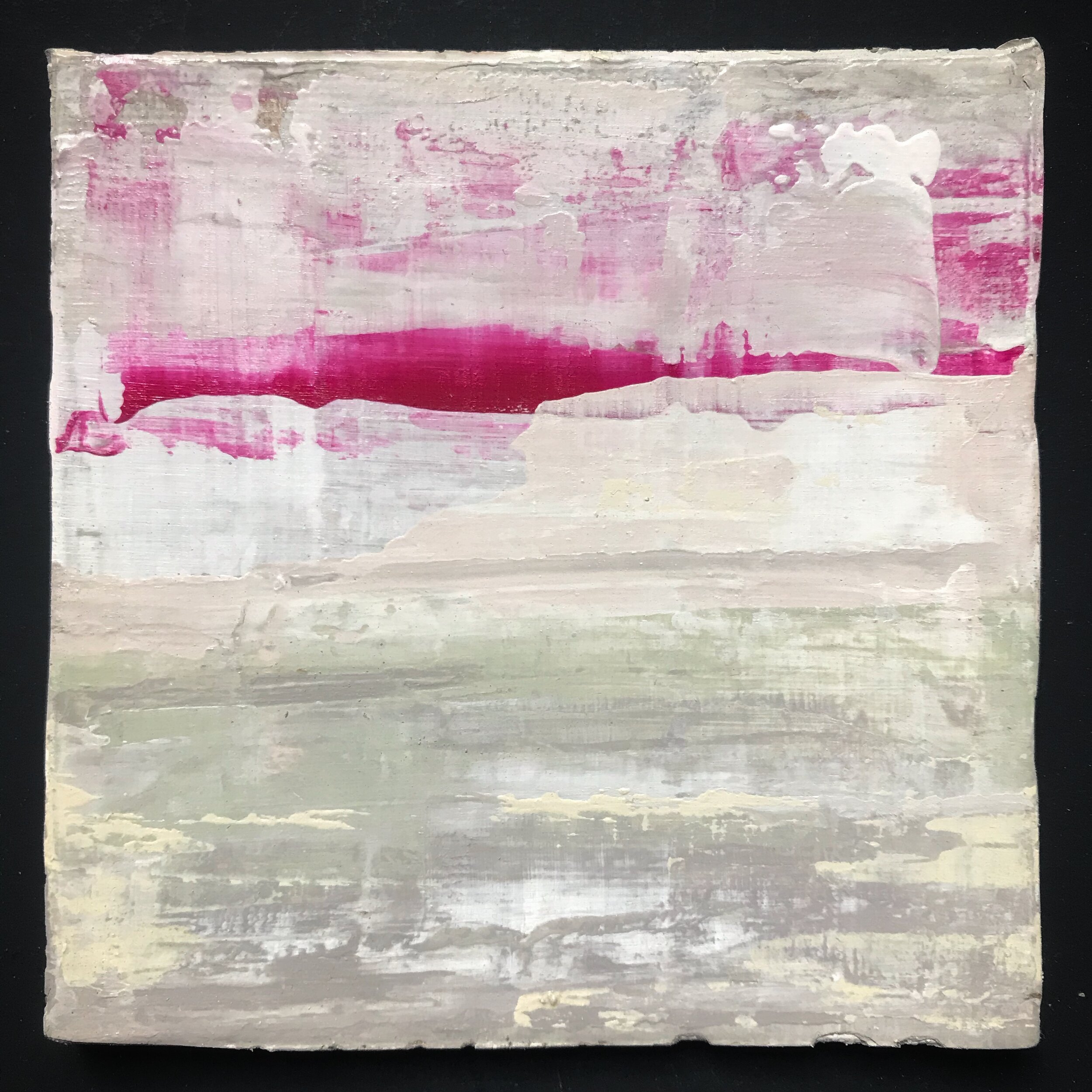
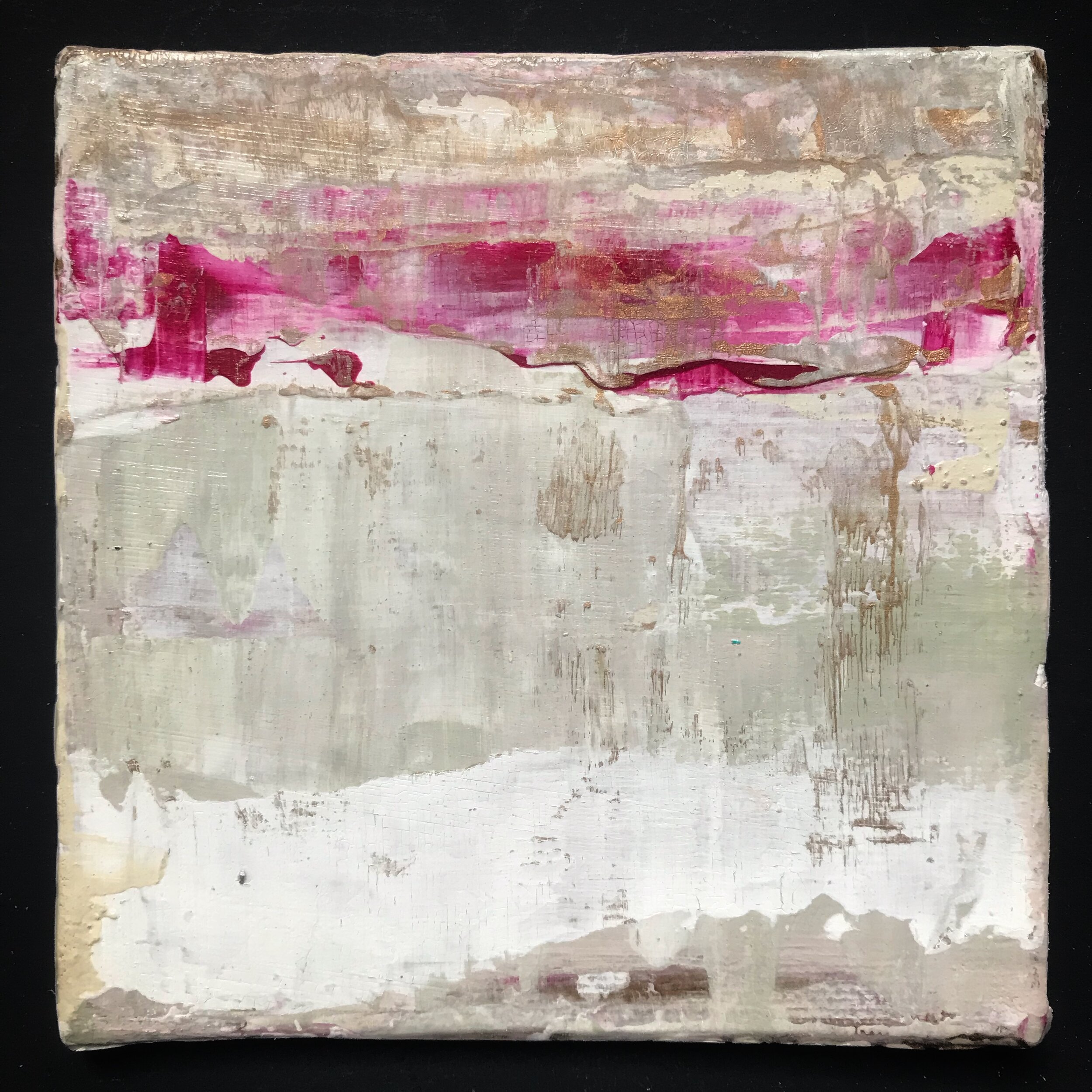
I came up with the idea of ‘seasonal miniatures’ and, if you follow me on Instagram, you’ll know I have been busy creating one hundred 10x10cm original pieces using four colour palettes to represent Spring, Summer, Autumn and Winter. It has actually been quite challenging, not only to make 100 pieces of art in a relatively short time but to also within such a small area. My style of art is generally suited to a much larger scale but I am really happy with how they have turned out.
I love putting together colour schemes so spending some quality time with my colour cards was pure joy!
I didn’t want my chosen palettes to be too obvious so I based them around the seasonal ones used in colour psychology - this takes a more emotional approach to colour, evoking feelings rather than using the traditional notions, for example: green for Spring, yellow for Summer etc.
Here’s what I came up with…
SPRING
Although Spring is my favourite season, the bright, playful colours associated with it don’t generally resonate with me (my preference is for muted tones). There is a lively and somewhat mischievous energy linked to the Spring personality and these people are typically outgoing and outdoorsy, two things I am not!
I am, however, rather drawn to anything fluorescent so I used these to create my Spring miniatures - mixed with a healthy dose of white, of course! I took inspiration from a larger painting I have done (which is called On A Mission and features on my homepage) and found that working with this palette came more naturally than I expected.
SUMMER
I am a Summer personality according to colour psychologists, so this was perhaps the easiest palette to put together. The Summer personality is the most shy and reserved of the four and is often someone who shuns the limelight (definitely me - I can’t bear even having my photo taken!). Style-wise, Summer is elegantly understated: think subtle tones and delicate, floaty fabrics.
For my paintings I have used colours that I am naturally drawn to: off-white and taupe combined with a muted pink and green, but I couldn’t resist adding a bit of magenta and gold to give them a bit of a lift.
AUTUMN
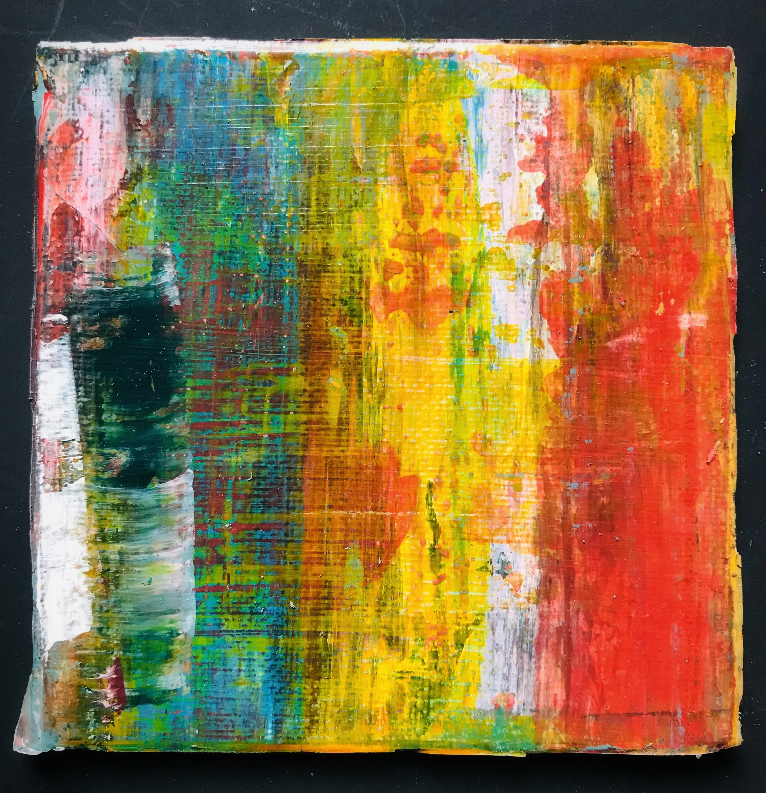
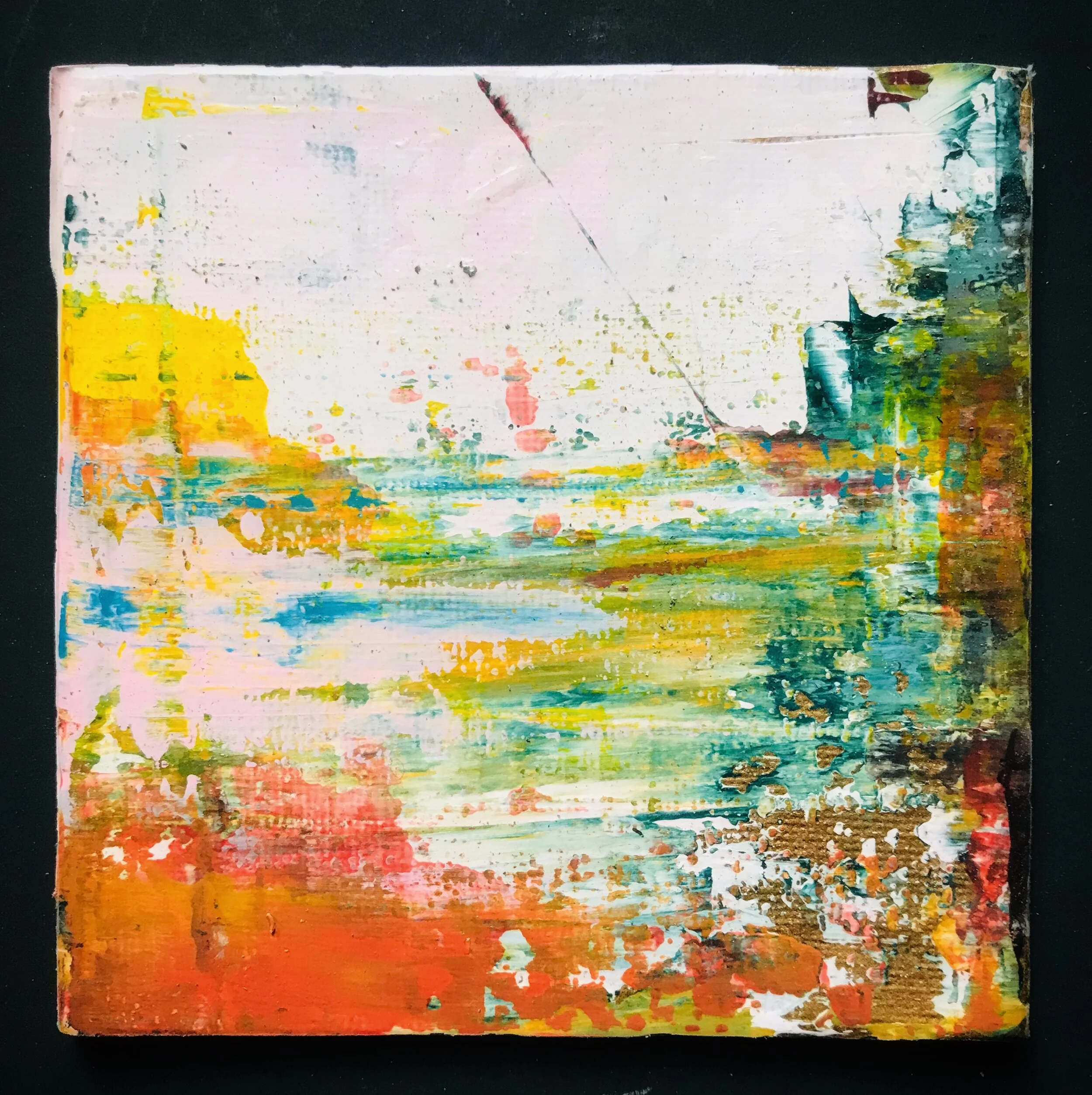
Autumn was the trickiest palette for me because these are colours that I don’t normally use in my work. Perhaps for this reason the finished paintings are the ones I am most pleased with - I was totally out of my comfort zone while doing these but I love challenge!
The obvious Autumn colours are orange and red but in addition I wanted to inject more of this season’s personality so I combined them with a deep blue/green (Mylands’ Borough Market) and one of this year’s most popular hues, ochre. As a whole the 25 canvas boards didn’t really work but each one came in to its own once I split them all up. The result is, I think, a vibrant expression of the Autumn personality ranging from warm and cosy to quirky and flamboyant.
WINTER
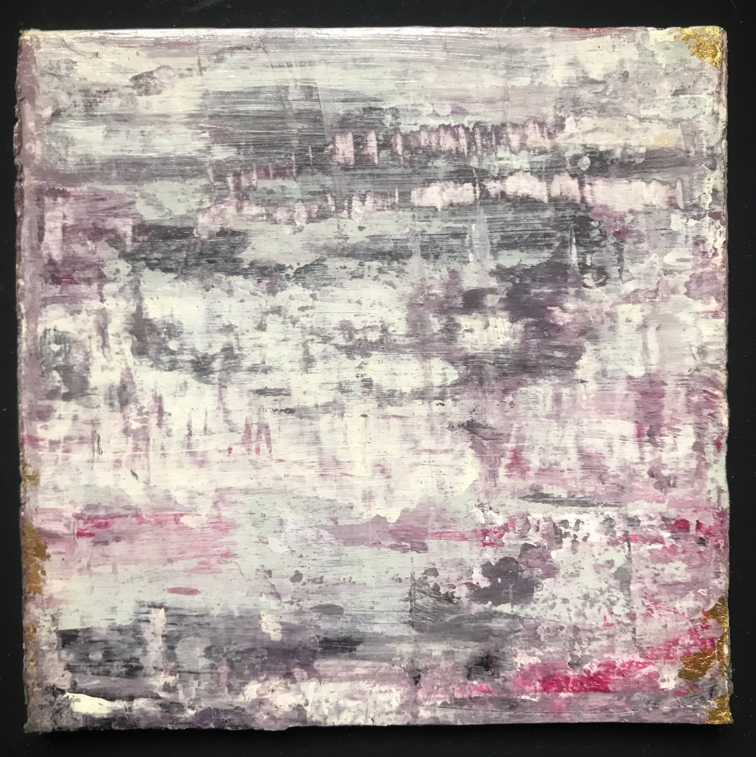
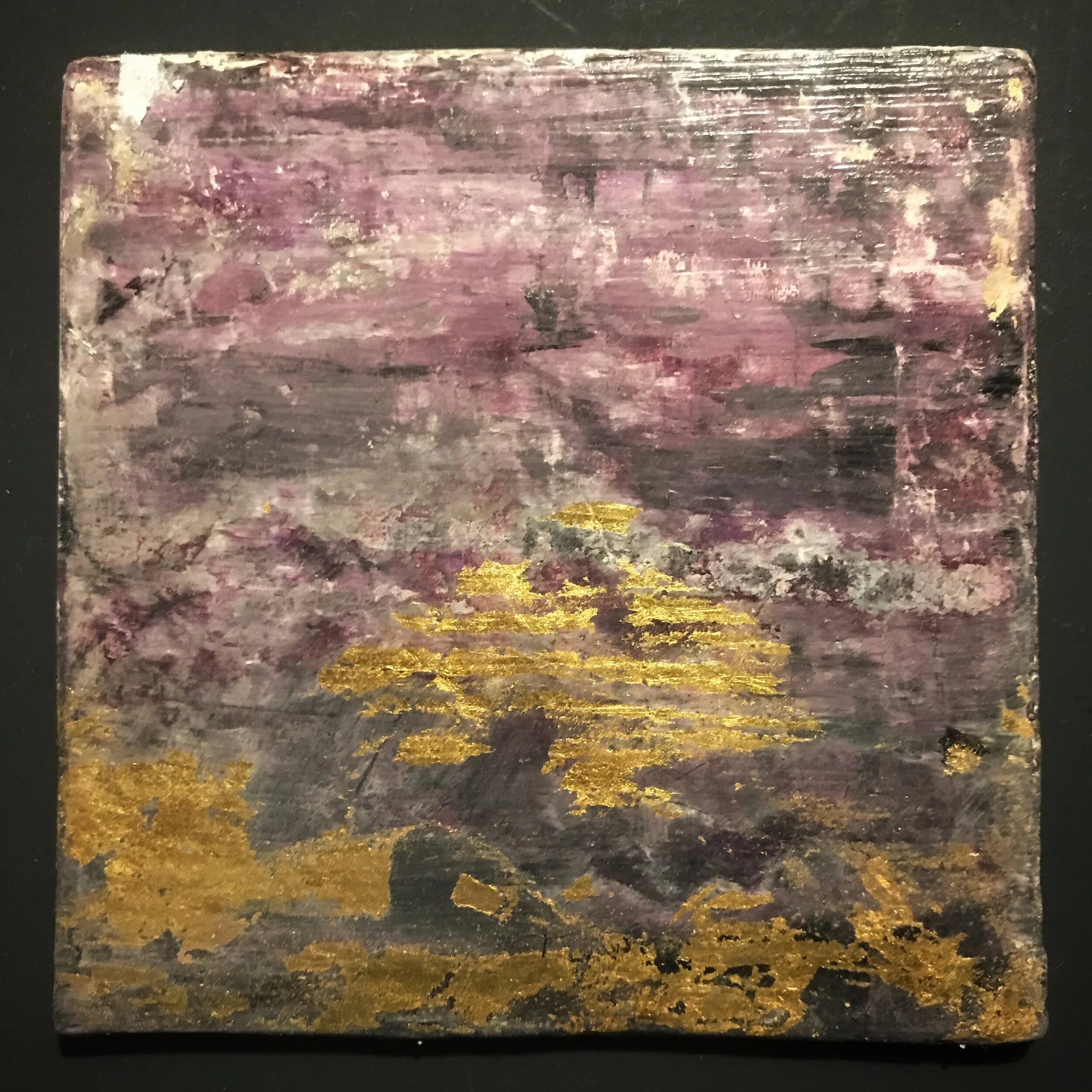
Winter is my secondary personality so again, this palette was quite easy to put together. It is quite similar to the summer palette but, in keeping with the rules of colour psychology, it’s the only one that includes black.
The Winter personality is as uncompromising as a cold, icy landscape. Although minimalist by nature, it is also glamorous and sophisticated with a love of drama. I have tried to capture that range in this group of paintings by using deep purples, black and gold through to pale pink, green and white.
I’d love to know which is your favourite palette!
Kx